
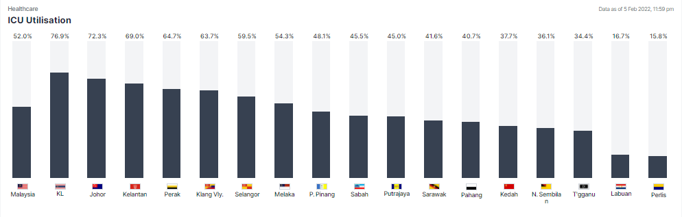
The following is the chart from Covicnow (https://covidnow.moh.gov.my/icu/). I will be recreating the chart based on the public domain data from Github
First, as usual, need to import Python packages.

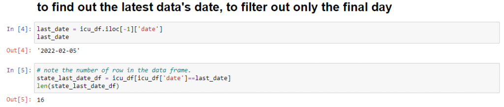
Then we need to read the CSV from MoH Github into a dataframe. Please note the number of rows (10551) and also the number of columns.

Since MoH raw data was appended with daily data into the same CSV, I only need to get the data from the latest date. This is how i get the latest date. After getting the date, I filter the data frame so that I have smaller data set to work on. As you can see, the final data frame is only with 16 rows.
Referring to the number in Covicnow chart and also the data from Github, I figured out that they include all ICU patients into the calculation, that makes sense since we are counting the ICU bed utilization to see if any state or the country is running out of ICU bed, regardless the reason using the bed.

Now add the new data, the sum of ICU+PUI+NonCovic into a new column and also remove all unnecessary columns that are not required for the chart.

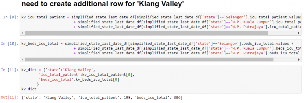
As usual, Covicnow adds another view of ‘Klang Valley’ into the chart. I have to calculate and include it in the data frame.
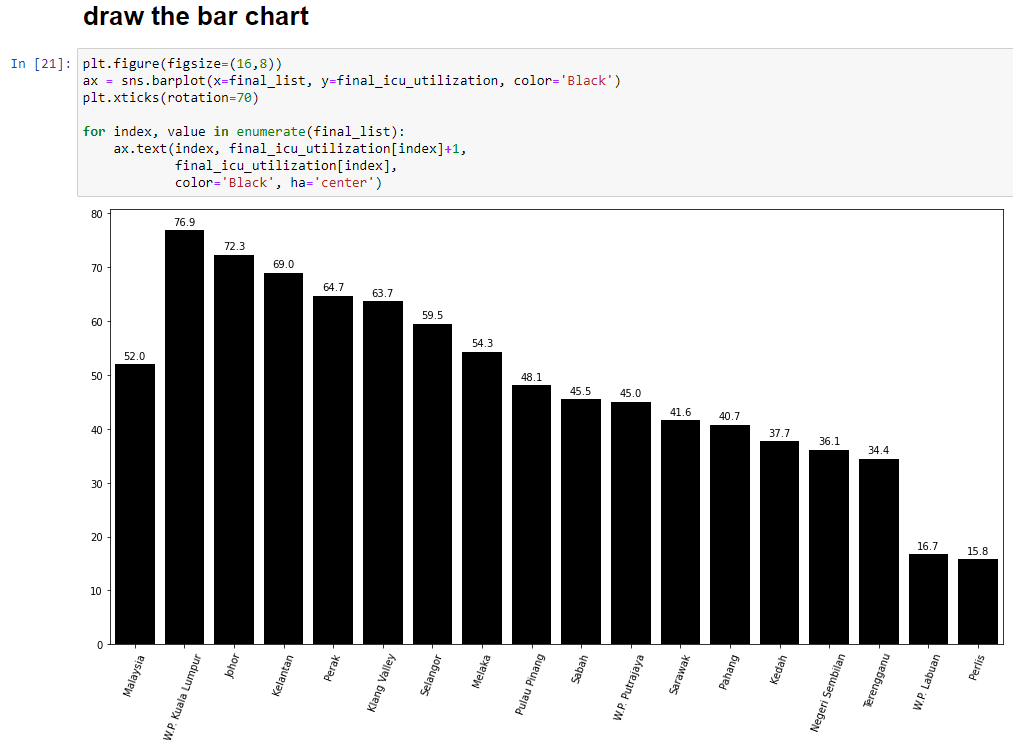
From the CovicNow chart above, you can see Malaysia’s number was included. We need to calculate it before we include the Klang Valley number into the data frame.

Now we can add ‘Klang Valley’ number into the data frame

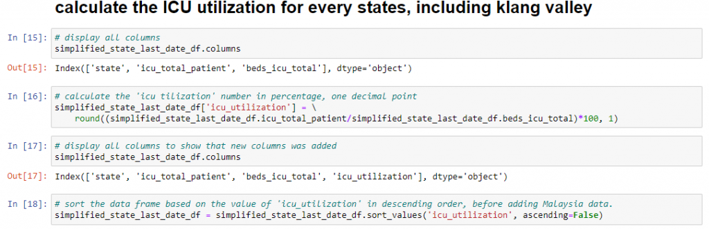
The chart uses the percentage, which is the total ICU patient over the total ICU bed. Also sort the data frame based on the utilization percentage, in descending order.
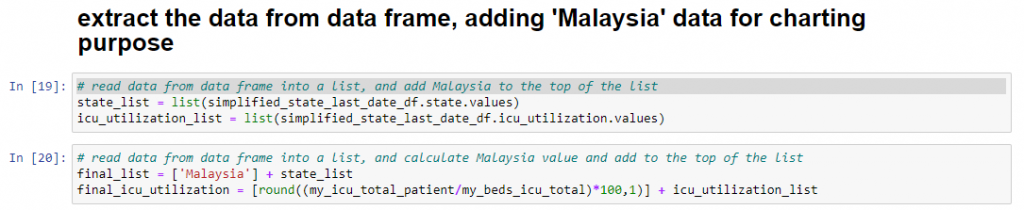
After sorting, we can now add Malaysia data to the top of the list for charting, since Covicnow chart shows Malaysia on the leftmost.
Now we can draw the bar chart.
Another simple chart reversed engineered. What an interesting weekend project.
You can get the notebook code from here
https://github.com/sckhoo/Covicnow_pandas/blob/main/002_ICU_utilization.ipynb
Feedback, suggestions are welcome. Thank you for reading.